Writing and drawing helps me understand myself, and when I was diagnosed with autism in 2022 I created this comic to process that huge development. It helped me realize that some fears are just reminders to protect my senses and to avoid getting overwhelmed. Breaking down fears into a checklist of things to watch out for made such an amazing difference in my perspective – it’s incredibly liberating!
I am quite good at writing lists, but not nearly as good at crossing things off. This particular list is something I want to keep working on until I can cross most of it off (EVERY instrument? Come on, Lauri.) so I decided to make a vibrant visual reminder. Like many others, I am a visual learner and can take in and remember information so much more easily with an image to hold onto rather than just an idea floating around in my head. This infographic is already working, reminding me to push myself when I have the opportunity and helping me expand my comfort zone in most of these areas.
Living with misophonia can be isolating and frustrating. And possibly unbearable for some. I hope this illustration can help others better understand what their friends and family members with misophonia are going through.
Think about your favorite piece of pottery – do you know how much work went into it? All of the hand lettered steps in this artwork would be part of the process of making a unique mug, adding up to many hours of work. This poster is dedicated to all of the potters out there putting lots of time, love and hard work into their craft.
I’m thrilled to have illustrated my first middle grade book, Puberty Is Gross But Also Really Awesome, written by the extremely funny and talented author, Gina Loveless and published by Penguin Random House in March 2021. It’s full of grossness, awkwardness, awesomeness and and so much enlightenment for every kind of kid. Several spots in the book called for hand lettering to add emphasis to certain concepts, which was a ton of fun and a great accompaniment to the comic style illustrations.
Colin Lapin is a good friend and an amazing writer. He somehow managed to create entire stories out of single sentences while playing with satisfying sounds and syllables. They fill me with curiosity and I love the questions that come up. How many times has the Argentinian barged in? Who taught the scorpion to sew? How does it wear skorts? Who knows the lyrics to Celine Dion’s songs? I wonder.
This is a mostly true story about a cat who lives in my neighborhood, but also a little bit about how my brain works.
I am so fascinated by the different ways autism can manifest in each individual on the spectrum. I’ve been learning a lot about autism this past year and thought I could share this big takeaway – that autism is not merely a difference of a little or a lot, high functioning or low functioning. There is so much more going on that what we observe from the outside – beautiful ways of thinking that are quite inconceivable to most people, along with a huge range of emotions, struggles, sensations and fixations. My intention with this artwork is to share the depth of this neurological disorder and the infinite array of possibilities it has to shape each unique individual on the spectrum.
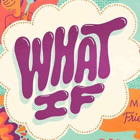
After the first few weeks of the 2020 coronavirus quarantine hysteria I had to make something to spread positive vibes (and find them in myself). This idea is based on a game I learned from Carrie Contey called ‘What If Up’ where instead of imagining worst case scenarios, you make all of your what-ifs positive. It works! Go ahead, give it a try.
I reached out to Climbing Magazine in 2019 with an idea to create an illustrated primer about the debut of climbing in the Olympics. They loved the idea and decided to turn it into a full spread to run alongside a great article written by John Burgman with all of the details about the events and scoring. To be able to work on a project combining two of my passions, illustration and climbing, was a dream come true. Many thanks to Matt Samet and John Burgman!
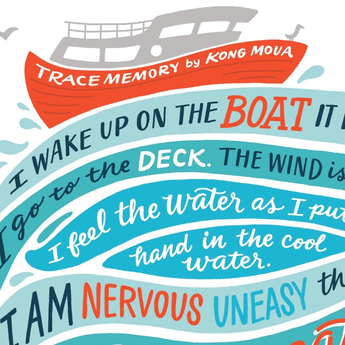
I had the pleasure of illustrating this piece for One Day magazine in June, 2019. The article is about creative writing courses for disabled adults and this illustration is based on a short poem from one of the students, Kong Moua. Many thanks to Maria Burke at One Day for the project.
Brand campaign lettering for Costa Sunglasses, a McGarrah Jessee client. Extensive exploration went into this project to create the perfect typographic style for the brand. I used a wide variety of media like markers, paint pens, brushes, bamboo pens, sticks dipped in ink and finally an ink dropper. We liked the looseness of the ink dropper style and the way the letterforms all fit together like puddles of liquid. Stunning portraits by Kenny Smith paired perfectly with the type in print and outdoor boards. This was a wonderful and fulfilling project with great creative direction from Tim Cole, Colin Lapin and Eric Erickson.
I started climbing near the end of 2018 and became COMPLETELY obsessed. It’s all I think about lately, so I had to make some art dedicated to my new thing. What I love about this kind of personal illustration is that it always connects me to other people. Many climbers seem to feel the same – I haven’t met many who are just casually interested. If you can’t get enough climbing talk, send me a message! And if you are with a gym or climbing equipment company, please hit me up – I have a ton of creative ideas that we could collaborate on.
This is a tribute to r/ShowerThoughts, a special corner of reddit full of absurd humor (and the occasional profound realization). These quotes are a few of my favorite posts and some of the most upvoted of all time.
This is another piece of my story and one that, until recently, I thought was a universal experience. Music makes it much more apparent and spurred conversations that led me to learn about this type of synesthesia.
Personal piece about moments I experienced from one side or another, when food was made or shared with love.
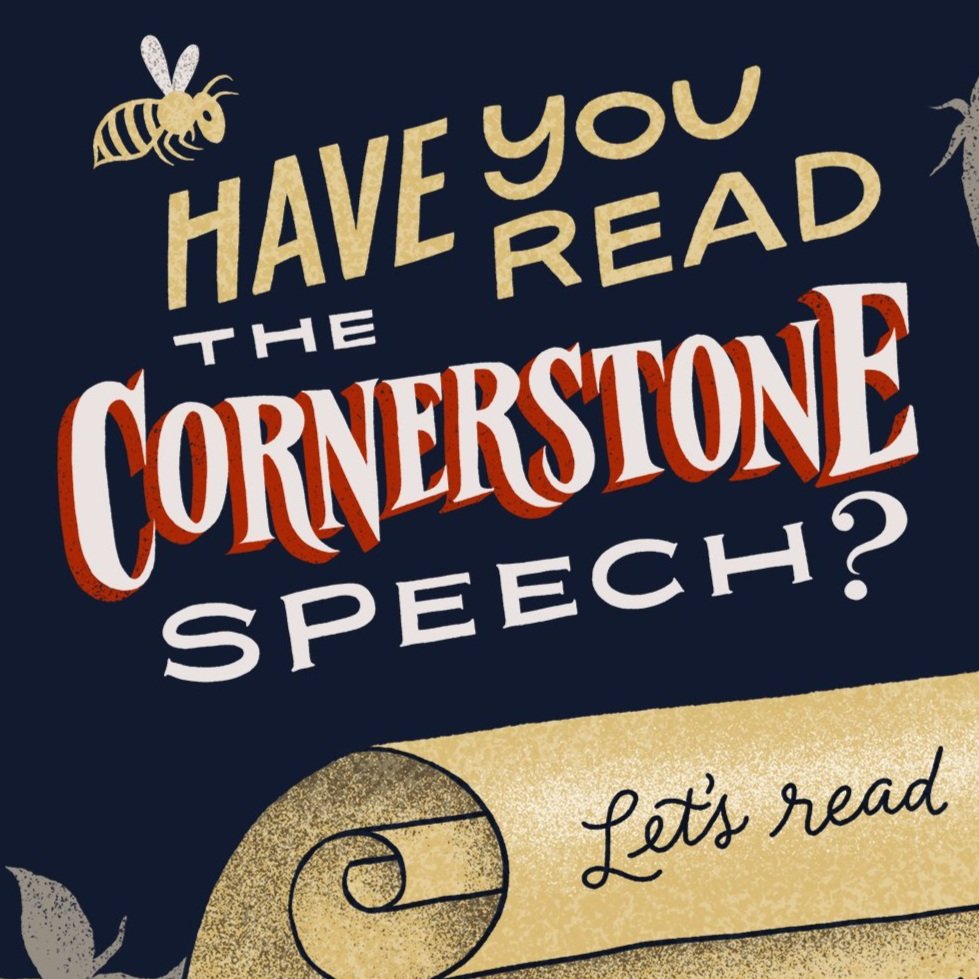
Personal project about a sad piece of our history in the United States that I felt more people needed to read.
People just want to be safe and happy and my heart goes out to those around the world who are scared and suffering.
Running + Rube Goldberg machines = great art direction from Kristi Flango for this fun hand lettered and illustrated poster for Brooks Running. Work done at McGarrah Jessee.
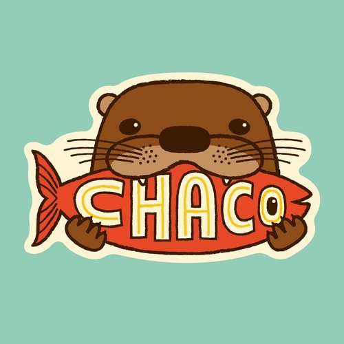
Chaco is a new client at McGarrah Jessee and I couldn't be more excited to work on their brand! These were part of a sticker exploration project for them that I had a ton of fun with.
After working on this project for 3 years, I'm thrilled to release this children's book with author Lori Otto Samocha. It's a fun alphabetical tour through our favorite city and is available for purchase on our site and at awesome local retailers like BookPeople and Blue Genie Art Bazaar.
Wisdom from Dolly Parton in 9 to 5 for my Lettering Lyrics series.
A Lettering Lyrics piece from Bohemian Rhapsody
Another one for my Lettering Lyrics series, this time from the beautiful Shins song Those To Come.
A piece in my Lettering Lyrics series. Stop what you're doing and listen to Bob Dylan.
A little personal lettering exercise with a quote from one of my all time favs – The Nightmare Before Christmas!
I've spent a lot of my free time in the garden this spring, preparing and planting and watching sprouts come up with my boys. They get so excited about "baby plants" and inspired me to do this illustration celebrating the sprouts' arrival.
A little tribute to the amazing people at McGarrah Jessee, written by the superbly talented Chris Barnard. I love you, McJers!
Every year, McGarrah Jessee hosts a party during SXSW. This year we decided to do a large scale version of our Friday morning tradition of making waffles in our kitchen. We had eight waffle stands with homemade waffles, a central stand with every topping imaginable, Shiner beermosas and micheladas and a gospel band. I drew some fun type for the logo to be printed on free takeaway mugs, and my friend Chandra and I painted the logo with syrup to use on signage and recipe cards. Check out the time-lapse video of the syrup painting.
One of the creative teams at McGarrah Jessee asked me to help out with some illustrations for their Costa Valentine's Day campaign. They wanted vintage style Valentines complete with absurdly cute characters and ridiculous puns. Kudos to Allie Nordstrom and Colin Lapin for the great idea and hilarious lines.
McGarrah Jessee client, Frost Bank, partnered with the Dallas Zoo to make a fun, educational activity book for young visitors. This was a dream project – getting to do tons of lettering and illustration, working with amazing writer Sarah Weigl, and spending hours looking at cute animal photos!
This project began with a newfound obsession for steel guitar, which ended up with me desperate to buy a resonator guitar. To help justify spending a big wad of cash on an instrument I had no idea how to play (but couldn't do without!!), I decided to sell some graphic styles I've been using in my design and illustration work that emulate the effects of running artwork through an old copier – a rugged, worn look that gives artwork a vintage feel. I designed some example pieces with the styles and gave them a space theme, just because I love space! Copier Funk is for sale on Creative Market!
Wreck it Ralph is one of the movies in our house that gets played over and over. The writers are absolutely brilliant and the list of names they came up with for the racers in the game, Sugar Rush, are SO hilarious (Swizzle Malarkey, Adorabeezle Winterpop and Sticky Whipplesnit to name a few). I had been practicing my vector lettering and chose a few to work on: Rancis Fluggerbutter, Minty Zaki, Crumbelina DiCaramello and Candlehead. If time ever allows, I'll do more (when?!).
Punch Press is a local letterpress shop that holds workshops for learning letterpress and book binding, as well as offering studio time. A friend and I loved the letterpress workshop and decided to make a video about our experience. It's still in progress (indefinitely), but hey, at least there's a title card!
Shiner first brewed Prickly Pear as a limited edition in their Brewer's Pride series. By popular demand, they brought it back as their new summer seasonal in 2015 with a brand new look. I had so much fun designing all of the packaging, including bottles, cans, six and twelve packs, cases, coasters and more.
A print and greeting card for optimists or celebrations or affirmations or answers or you name it!
Making gift tags is one of my favorite things to do during the holidays – I love cutting out different shapes and lettering names and fun messages. This project was the natural graphic-designer-must-die-cut-things progression from that and in 2014 my packages were extra adorable! Bonus adorableness: they are excellent ornaments as well.
Designing and illustrating the kids meal bags for Whataburger was one of the best projects I've ever had! I love illustrating for children and had so much fun working on these with a super talented team – art director Ross Aboud and writer Kevin Dunleavy.
Shiner sponsored a series of parties/concerts dedicated to Waylon Jennings, benefitting the Waylon Fund, which raises money for diabetes research. I created posters, banners and other materials for the parties.